Monday, November 16, 2009

Drawings without Paper

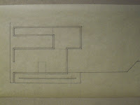
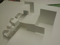
This assignment was to interpret and recreate a drawing using different materials. For my two drawings, I used copper wire and plaster. The wire proved to be the easiest to work with and was the easiest to understand. I started off with a very simple sculpture of a section and added depth to the drawing by moving things forward or backward in space depending on their location in the plan.


This is the first wire sculpture I made and I believe it is the most successful. It captures the simplicity of the folds, creates depth, and is very straightforward.


This is the second wire sculpture. When I made this, I was thinking about my building as a series of strips that are folded independently of one another. This idea translated into the drawing being made as a series of two dimensional sections that were stacked together to create depth and represent the drawing.


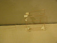
This was the final wire sculpture. My conception of the building had changed a little bit since the first two sculptures. After some thinking and some sketching, I thought of my building as being formed from one continuous surface that was folded and cut and created both the exterior and the interior. I don't feel that this is as successful as my first sculpture because I tried to represent the drawing too literally.

Sunday, November 15, 2009

Since the 2nd Crit

Since the crit, I have mainly concerned myself with exterior form and how to better express the folding gesture. I started by creating a new model that creates some new spaces and reconfigures some previously existing spaces.


Again, the rigidity of the modeling material is an issue.

While this model was interesting, it was much too complicated.Simplification would help reinforce the gesture, but for a while I struggled with how it should be done.

After reading the blog post 'on minimalism'(link in the links section), I got some new ideas on how to reinterpret my project. There were many projects talked about in the post, but a few stuck out to me the most, like the Laboratory at Utrecht by UN StudioThe Eyebeam Museum by diller + scofidio, and The Maritime Youth Center by BIG + JDS.


After looking at projects like those, I sketched this. To me it seems to articulate the gesture a lot better and begins to express the continuity I have been thinking of.

Second mid crit

Another mid crit, except this time it was like a competition judged mainly by the studio with Professor Thurlow as the moderator. My project has evolved a lot in the week since the last crit, but as always there are issues to work out. The form has been refined, but the concept is largely unchanged. The main criticism I received was something that I hear a lot. What I was trying to do and what my words and diagrams described were something much more than what my drawings and models show. The concept was illustrated a little bit better in my drawings, but the graphic representation still has a ways to go.


Mid Crit


While the deficiencies in my project were brought to light, the guest critics provided many ideas on how to refine my process and representation. While the folding process was illustrated in the model, it was lost in almost all of the drawings.


This section seemed to illustrate the folding concept the best.

Almost all of the suggestions made pertained to my design process. It was suggested that there could be multiple folding processes. Right now, with just one folding element, the folds don't suggest hierarchy within the spaces or the program. What I decided to do is study the spaces individually and analyze how they should be articulated and where they should be located.


The next issue to think about is how my building interacts with the ground. This was explored at the same time as the interactions between the folding elements. I thought that the best way to do this was a series of sections.


After that I thought about how the different folding systems would be articulated.

Further Development

After studying the paper models and making a few new ones, I had to take all the things I liked and try to combine them into one, final folded paper model. It was a little bit difficult since some of the things I liked didn't work well together. Ultimately, not everything good was carried through, but I did end up with a finished product I was happy with.

After the exploration, I decided that a series of sections would be the best way to study how the folding process forms my spaces and how the plane folds throughout the building.


The next problem to tackle is how to integrate the design with the site.

Sunday, October 18, 2009

Paper Models


This model was mainly composed of larger folds. There are some larger spaces created with larger spaces floating on top.


This model has many smaller spaces and some longer, linear spaces. The majority of the spaces are above the ground plane.


This model is very similar to the O'Gorman library. It has a tower with smaller spaces attached to it. There are also some covered areas along the perimeter.


This model has a large open area in the middle. The linear area could have some interesting sectional qualities and a mix of different sized spaces.


This was the last model I built. It has a combination of covered exterior spaces, larger folds, and a linear space that could have some interesting sectional qualities.

Mapping Assignment


The concept for the first two maps was an interpretation of the viewing angles of the murals on campus.


This first map tried to express the interaction of the murals and the buildings. It maps where you can and can't see each mural. The map is built in layers that can be taken apart and viewed individually. The different layers represent different heights above ground level.


This map takes the viewing angles and interprets them as corridors. Within these corridors, a transition takes place between seeing and not seeing the murals. The importance of each mural is expressed through the relative height of the corridors.


The concept for this map was an interpretation of the campus in a style similar to the second assignment. I tried to express the major elements of the buildings and landscape through the folding of paper.