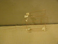
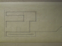
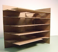
These were all made from bent acrylic. This could be useful as a building technique for diagram models.
Monday, November 23, 2009
Thursday, November 19, 2009
Where I've been
After some thought on the issue, I decided that a purely organic form wasn't really conducive to the program I need to accommodate and decided that I would have to combine the organic and the geometric. This is a change from before, since my models weren't really a combination but were more in the gray area in between organic and geometric.


After showing these sketches he suggested some projects that I should look at: The library at the university of Delft by Mechanoo, The Villa VPRO by MVRDV, and The Eyebeam Institute by diller + scofidio(I had previously looked at this). These projects sparked some ideas, so I'll see what I come up with.
Tuesday, November 17, 2009
Where I am
I decided to adopt a more organic form, but was stuck on the question of how to fit the program. I decided that the folding element should be used as a regulating element that holds the program pieces, similar to early process work. The organic form is still used on the exterior. Taking some hints from the library at Delft, I decided that the link between the landscape and my building should be strong enough that the building conceivable could grow out of the ground itself and that certain areas should continue the vegetation, maybe even the grid pattern, in the university around my site.
Monday, November 16, 2009
Drawings without Paper: What have I learned
While I didn't really like this assignment, I can't say that I didn't learn anything from it. During the review, concepts of purposefulness and the battle between an organic form and rigid geometry were brought up. I hadn't really considered either of those ideas before then.
The idea of purposefulness brought up when the fold were discussed. While the folds are used as my form making strategy, the purpose of them still had a bit of arbitrariness in it. In relation to the two "drawings", purposefulness was brought up in relation to some of the moves I had made and whether or not they were necessary.
The battle between an organic form and rigid geometry has been ongoing for me. Not really in my design process, but in my attempts to model my concepts. The materials I had been using were very conducive to my concept, but weren't rigid enough to hold the lines, folds, and forms I have been trying to create.
From here, I took these concepts and the idea of continuity from before and decided to rethink what I was doing and where I was going. I decided that the "slouching" shapes that were present in my model, but not my drawings, should be embraced and have since began to incorporate them in my design. I am working on taking the folding element and making it the regulating element it was supposed to be, enclosing and combining program. This also helps bring some purposefulness into the design. I am also working on the concept of continuity by trying to make the folding element come from the landscape rather than an artificial element placed on the site. This combined with the new organic form has helped me start developing a better site strategy.
On a smaller note, the wire sculpture made me realize that the continuity of landscape I had been looking for wasn't just in the forms I created. The forms I created had two sides that were formed by folding up one continuous plane, namely the landscape. This realization has definitely changed the way I have been thinking about the form making process I have been using.
Drawings without Paper continued
The second half of the Drawings without Paper assignment was a stereotomic "drawing". I chose to do this in cast plaster. This model was thick and had a massive quality to it. The thickness of it created a very good potential to play with depth in conveying the drawing. The drawing I chose to represent was a sectional axonometric. The section was cut in a similar place to the section used for the wire drawing.
The first attempt at casting plaster was definitely a failure. The model broke while I was taking off the mold. It didn't read very well and the plaster mix was so wet that it never really dried. However, I learned a lot from making it since it was the first time I had ever cast plaster.
From there I made another mold and applied what I had learned from the previous failure. The plaster mix was still a little wet, but not nearly as bad this time around.
The cast was a lot thicker than before to accommodate the increased depth and to strengthen the rest of the cast. In the first one, some areas were so thin that they cracked if they were handled.
Some of the raised "islands" cracked on the corners as the mold was taken out of the lower areas. Also, some of the thinner pieces cracked off because the plaster was still moist when the mold was removed.
Although it looks messy when viewed straight on, it's still somewhat legible as a drawing.
The shadow lines definitely help the legibility. The cut lines were the most recessed and the darkness of the shadows created help to bring them out. Overall, the result was only satisfactory, but I learned a lot about the process and about my design through this assignment.
Drawings without Paper
This assignment was to interpret and recreate a drawing using different materials. For my two drawings, I used copper wire and plaster. The wire proved to be the easiest to work with and was the easiest to understand. I started off with a very simple sculpture of a section and added depth to the drawing by moving things forward or backward in space depending on their location in the plan.
This is the first wire sculpture I made and I believe it is the most successful. It captures the simplicity of the folds, creates depth, and is very straightforward.
This is the second wire sculpture. When I made this, I was thinking about my building as a series of strips that are folded independently of one another. This idea translated into the drawing being made as a series of two dimensional sections that were stacked together to create depth and represent the drawing.
This was the final wire sculpture. My conception of the building had changed a little bit since the first two sculptures. After some thinking and some sketching, I thought of my building as being formed from one continuous surface that was folded and cut and created both the exterior and the interior. I don't feel that this is as successful as my first sculpture because I tried to represent the drawing too literally.
Sunday, November 15, 2009
Since the 2nd Crit
Since the crit, I have mainly concerned myself with exterior form and how to better express the folding gesture. I started by creating a new model that creates some new spaces and reconfigures some previously existing spaces.
While this model was interesting, it was much too complicated.Simplification would help reinforce the gesture, but for a while I struggled with how it should be done.
After reading the blog post 'on minimalism'(link in the links section), I got some new ideas on how to reinterpret my project. There were many projects talked about in the post, but a few stuck out to me the most, like the Laboratory at Utrecht by UN Studio, The Eyebeam Museum by diller + scofidio, and The Maritime Youth Center by BIG + JDS.
Again, the rigidity of the modeling material is an issue.
While this model was interesting, it was much too complicated.Simplification would help reinforce the gesture, but for a while I struggled with how it should be done.
After reading the blog post 'on minimalism'(link in the links section), I got some new ideas on how to reinterpret my project. There were many projects talked about in the post, but a few stuck out to me the most, like the Laboratory at Utrecht by UN Studio, The Eyebeam Museum by diller + scofidio, and The Maritime Youth Center by BIG + JDS.
After looking at projects like those, I sketched this. To me it seems to articulate the gesture a lot better and begins to express the continuity I have been thinking of.
Second mid crit
Another mid crit, except this time it was like a competition judged mainly by the studio with Professor Thurlow as the moderator. My project has evolved a lot in the week since the last crit, but as always there are issues to work out. The form has been refined, but the concept is largely unchanged. The main criticism I received was something that I hear a lot. What I was trying to do and what my words and diagrams described were something much more than what my drawings and models show. The concept was illustrated a little bit better in my drawings, but the graphic representation still has a ways to go.
Mid Crit
While the deficiencies in my project were brought to light, the guest critics provided many ideas on how to refine my process and representation. While the folding process was illustrated in the model, it was lost in almost all of the drawings.

This section seemed to illustrate the folding concept the best.
Almost all of the suggestions made pertained to my design process. It was suggested that there could be multiple folding processes. Right now, with just one folding element, the folds don't suggest hierarchy within the spaces or the program. What I decided to do is study the spaces individually and analyze how they should be articulated and where they should be located.

The next issue to think about is how my building interacts with the ground. This was explored at the same time as the interactions between the folding elements. I thought that the best way to do this was a series of sections.
After that I thought about how the different folding systems would be articulated.
Further Development
After studying the paper models and making a few new ones, I had to take all the things I liked and try to combine them into one, final folded paper model. It was a little bit difficult since some of the things I liked didn't work well together. Ultimately, not everything good was carried through, but I did end up with a finished product I was happy with.
After the exploration, I decided that a series of sections would be the best way to study how the folding process forms my spaces and how the plane folds throughout the building.
The next problem to tackle is how to integrate the design with the site.
After the exploration, I decided that a series of sections would be the best way to study how the folding process forms my spaces and how the plane folds throughout the building.
The next problem to tackle is how to integrate the design with the site.
Sunday, October 18, 2009
Paper Models
This model was mainly composed of larger folds. There are some larger spaces created with larger spaces floating on top.
 This model has many smaller spaces and some longer, linear spaces. The majority of the spaces are above the ground plane.

 This model is very similar to the O'Gorman library. It has a tower with smaller spaces attached to it. There are also some covered areas along the perimeter.
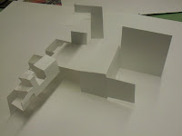
 This model has a large open area in the middle. The linear area could have some interesting sectional qualities and a mix of different sized spaces.
This was the last model I built. It has a combination of covered exterior spaces, larger folds, and a linear space that could have some interesting sectional qualities.
 This model has many smaller spaces and some longer, linear spaces. The majority of the spaces are above the ground plane.
 This model is very similar to the O'Gorman library. It has a tower with smaller spaces attached to it. There are also some covered areas along the perimeter.
 This model has a large open area in the middle. The linear area could have some interesting sectional qualities and a mix of different sized spaces.
This was the last model I built. It has a combination of covered exterior spaces, larger folds, and a linear space that could have some interesting sectional qualities.
Mapping Assignment
The concept for the first two maps was an interpretation of the viewing angles of the murals on campus.
This first map tried to express the interaction of the murals and the buildings. It maps where you can and can't see each mural. The map is built in layers that can be taken apart and viewed individually. The different layers represent different heights above ground level.

This map takes the viewing angles and interprets them as corridors. Within these corridors, a transition takes place between seeing and not seeing the murals. The importance of each mural is expressed through the relative height of the corridors.

The concept for this map was an interpretation of the campus in a style similar to the second assignment. I tried to express the major elements of the buildings and landscape through the folding of paper.
Sunday, September 27, 2009
map 3 concept

This is the concept for my third map. I tried to express the landscape of the campus and the buildings through the same folding technique I used in my last assignment. I feel like the direction I am going in has potential, but there are still questions to be answered.
How can I better express the folding technique?
How can I make this read more like a drawing?
How can I better connect the drawdle to the landscape it represents?
For the rest of the day I'll be trying to answer those questions. Hopefully I can arrive at some worthwhile answers.
Monday, September 21, 2009
finally in the zone
The area that I will be studying in the UNAM campus is the northeast corner. I will also be looking at the campus as a whole and the relationship of the edges to the outside. What I am studying and trying to show is the collision of geometric systems that exist within the campus and how these shape an almost continuous landscape into many courtyards and fields. I am also going to study the points of plastic integration, what story they tell, how do you experience them, and what their area of influence is.
Sunday, September 20, 2009
What's in the box?
Assignment 2 called on me to imagine the many possibilities of what occupies the space in the library stacks tower. My concept was that the mural elements on the facade intrude into the box and create space by manifesting themselves as solids or voids.

As I continued the project, I combined the two ideas into one complete concept. I decided that there was a box within the stacks tower that was being punctured by the extruded facade elements. The punctures started to dissolve the box and the solid masses also shaped the floor plates because none of them fit perfectly, some voids were too small for the solids to fit while some were too large.

After this model, I decided to take the erosion further. Luis suggested that I look at some of Jorge Oteiza's sculptures as inspiration.


Through further exploration and after a quick model study of Oteiza's "Homage to Mallarme", I decided to experiment with a combination of folding planes to suggest rather than create the box within.


All that I had learned and thought culminated in my final study. In it, I used Oteiza's technique of folding to create the spaces, voids, and planes I had played with earlier, but with a unified language.

Subscribe to:
Comments (Atom)


